Usability User Interface (UI) Affordance Information Architecture User Journey Wireframe Prototype Accessibility Heuristic Evaluation User Persona User Scenario UX | UI Designer Cognitive Load Gestalt Principles Responsive Design Interaction User Testing A/B Testing Iterative Jasin Weiner Design Design Thinking Card Sorting Usability Testing Proudut Design Empathy Map Only Solutions User Flow Touchpoints Mood Board Style Guide Design System Visual Hierarchy Color Theory Typography Customer Experience User-Centered Design Empathy Mapping Human-Centered Design Contextual Inquiry Participatory Design UX/UI

Fandango is one of the leading movie ticketing platforms whose aim is to “delight movie fans” and deliver the “total movie experience -anytime, anywhere.” However, while exploring the mobile app, our team noticed that Fandango was missing an essential part of the movie experience: concessions.
User Research,
Interaction, Visual
design,Pixel Pushing Prototyping & Usability Testing
My Partners in Crime
Kalsang Bhutia
Jacquelyn Piansay
Role
Tools
Figma
Axure
Miro
Trello
Otter
Zoom
Google Docs
Duration
2 Weeks/ 2 Time Zones
What do we want? Concessions!
When do we want it? When we order it online!
Since Fandango was missing a way to order concessions online we came up with the Problem statement: Ali needs a way to purchase concessions on the Fandango mobile app in order to decrease time spent in line and facilitate a more efficient and safer movie-going experience.
We believe our Solution to be that by building a feature to pre-order concessions for users, we will achieve a seamless, more efficient, and safer movie-going experience.
We did 6 User Interviews in one round. Jacquelyn did the interviews, while we observed and took notes.

-
“I get concessions pretty much all the time because it's like a guilty habit… I think it's just the smell of popcorn going in. I just want to get popcorn.
-
“Once in a while, if I'm really hungry, maybe I'll snag a hotdog but I'd say the popcorn, soda, candy -the big three. I'd say I usually get those.”
-
“If you're running late for your movie already then spending more time getting concessions is not ideal. It's annoying.”
-
“Well the first thing is finding the shortest line because I don't want to wait. If [my partner] is waiting in line for concessions, I'll go and grab our drinks that way we can kind of shorten the time.”
-
“Since I'm ordering [for multiple people] and there's a lot of people behind me, it's kind of embarrassing that I'm ordering [a lot] and holding up the line… I feel like they're rushing me.”
We wanted to know who was doing concessions and how? Kalsang did Comparative Analysis on Starbucks and Chipotle. I Focused on Comparative and Task Analysis with my attention on AMC, Alamo Drafthouse, Harkins and Movietickets.com.


We learned that Chipotle and Starbucks did a really great job with online orders by keeping it like the store experience and this mimicry of real life was something we wanted to take into account as we built out our user flows.

PROS
-
Purchase concessions online
-
Purchase concessions without a ticket
-
Integrate SMS notifications
-
Reorder from your saved favorites as a member
DELTAS
-
Buttons too close together
-
Poor aesthetics
-
Screen jumps to the bottom of the page to show tickets
-
One competitor recommended signing up with Fandango


By doing a task analysis we were able to see how users purchase movie tickets with Fandango and mimic it in the concession buying process.
Deciding on what to put in a MVP could be difficult, however, my partners and I had excellent communication and created a working agreement to help us stay on track. Using the MoSCoW prioritization method, helped us determine what would be best fo the users. we could now move forward.

From the research we synthesized Kalsang created two distinct Personas to better guide us to create the easiest path for our users.Because watching movies and eating concessions are for everyone.


I was tasked with creating the User Flow for Initial Product Discovery and Checkout, while Jacquelyn created one for Post-Purchace Discovery.
These were created in Axure.

Working together we remotely conducted a Designed Studio for several hours. We came up with ideas we thought would fit into Fandango's existing app and style. Although this practice was extremely helpful we quickly realized it would be more productive to switch to wireframing in Figma were we could collaborate easier.


_JPG.jpg)
Starting to work on Lo-FI Wireframes I concentrated mostly on what browsing and purchasing concessions would look like . Starting with the rectangular system fandango uses I made the boxes too small and not very engaging. Eventually we turned the menu items in to menu cards were you could look at nutritional info and add ons if appropriate.
Jacquelyn worked on creating a smoother check out process that was clear and informative.
Kalsang worked on the onboarding and what it would look like to potentially team up with Uber
Lo-FI Usability Test
6 Minutes
Average time to
completion
5 Errors
Average number
of errors
83% Success Average task
completion
“Confused about which theatre to click into.” - User tried the search bar first
“Inconsistencies in the payment screens.”
“Surprised to see a confirmation for my phone number, that generally doesn't happen.”
“Slow to load certain screens. Target needs to be bigger for combo dropdown arrow.”


Well that didn't go to plan, But surely our Mid-FI Wireframes will be perfect.

midfi.png)


MID-FI Usability Test
8.5 Minutes
Average time to
completion
5 Errors
Average number
of errors
80% Success Average task
completion
“Went to popcorn first, not much of a combo girl."
“I like to make sure all the payment information is correct.”
“Compared to other sections, the Combo/Food section seemed plain.”
“Customize option in concessions feels hidden, wouldn't know it was
an option to customize.”
Although the second round of testing was more successful, we did not see the results we were craving. So for our
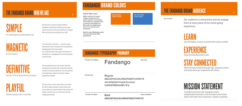
HI-FI Wireframes we focused on adding more visual elements, animation, and final copy, we turned to Fandango’s Brand Guide to captured the appropriate voice, messaging, and feel in our designs.
Taking feed back form our second round of usability testing we...
-
Added information about the two new features in on ‘Spotlight’ screen
-
Added a modal before the theater selection screen to highlight the ‘Concessions’ feature
-
Moved the ‘Look for the Popcorn’ banner to the top of the screen and increased the size
-
Corrected the movie date and time screens to decrease confusion
-
Iterated the ‘Concessions’ cards on category and subcategory screens
-
Added ‘Recommended A Combo’ card in the ‘Popcorn’ subcategory
-
Changed ‘All’ in Concessions tabs to ‘Menu’
-
Simplified the ‘My Experience’ order summary


HI-FI Usability Test
We experienced some issues with Figma that affected our testing
15 Minutes
Average time to
completion
9 Errors
Average number
of errors
63% Success Average task
completion
“Very similar to other movie apps, never had to buy food through a movie app so that's different.”
“Food ordering was similar to GrubHub so that was good.”
After a two-week sprint, our team successfully addressed the design opportunity that we confirmed through our research.
-
Integrated concessions into the app’s existing e-commerce
-
Redesigned the payment flow and mechanisms to access upcoming tickets and/or food orders
-
Added a featured partnership with Uber providing users with easier access to transportation to the theater and discounts on future Fandango purchases

After all is said and done we felt successful in adding the "My Concessions" feature to match the Fandango brand and style. If we ever get the chance to continue with to continue with this project I would be honored to work with this team again and here are some of our Future Iterations we would like to explore.
-
Make sure screens are responsive to different devices
-
Changing global navigation to include ‘Concessions’
-
Maybe move content from ‘Trailers’ under ‘Spotlight’ or ‘Movies’
-
-
Seat Delivery Options
-
Some theaters have seat delivery as an option already (Alamo Drafthouse and AMC)
-
Especially for some users like Julia who have mobility issues
-
Toggle on/off for theatres that offer both options
-
-
Include a way to leave tips, when applicable
-
“Gifting” concessions to a friend
-
Adding animations
-
Loading screens
-
Popcorn ‘popping’ when adding items (add to Fandango’s “playful” style)
-